 Whenever I go to New Orleans – which is as often as I get the chance – I visit Brad Pitt’s Make It Right project in the Lower Ninth Ward. That’s the one where he invited the world’s architectural elite – Frank Gehry, Kieran-Timberlake, and Thom Mayne, to name three – to design homes on lots that were leveled by Hurricane Katrina. There was one major catch: the homes had to be built for less than $150,000, which proved a tough hurdle for some of the architects to willingly jump.
When the prototypes first started appearing a decade ago, along with attendant media hype, I mostly felt sorry for the people who lived there, though Pitt and his foundation subsidized prices so that locals could afford the homes. Even so, it was a though architects had foisted their design agenda – the Thom Mayne home was designed to float away like a boat, the pink Frank Gehry duplex looked like it was inspired by Star Wars – on people who were recovering from tragedy and just wanted a place to live. Many of the designs never made it past the prototype stage because the architects couldn’t bring them in for less than the price limit. The New York Times wrote at the time that “the houses seem better suited to an exhibition of avant-garde architecture than to a neighborhood struggling to recover.”
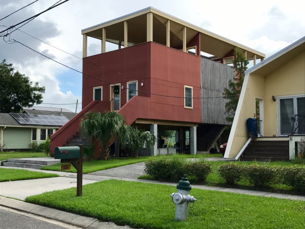
Now that the project of roughly five square blocks is nearly complete, it looks much better than it did with a few homes scattered on random lots. In fact, it looks like a real neighborhood, though a very different one than you find elsewhere in New Orleans. The big change is there’s now a streetscape, created by sidewalks, mature trees, grills, and other welcome evidence of everyday human life. Homeowners have access to an urban farm, a tot lot, and a commemorative garden. This looks like a fun place to live.
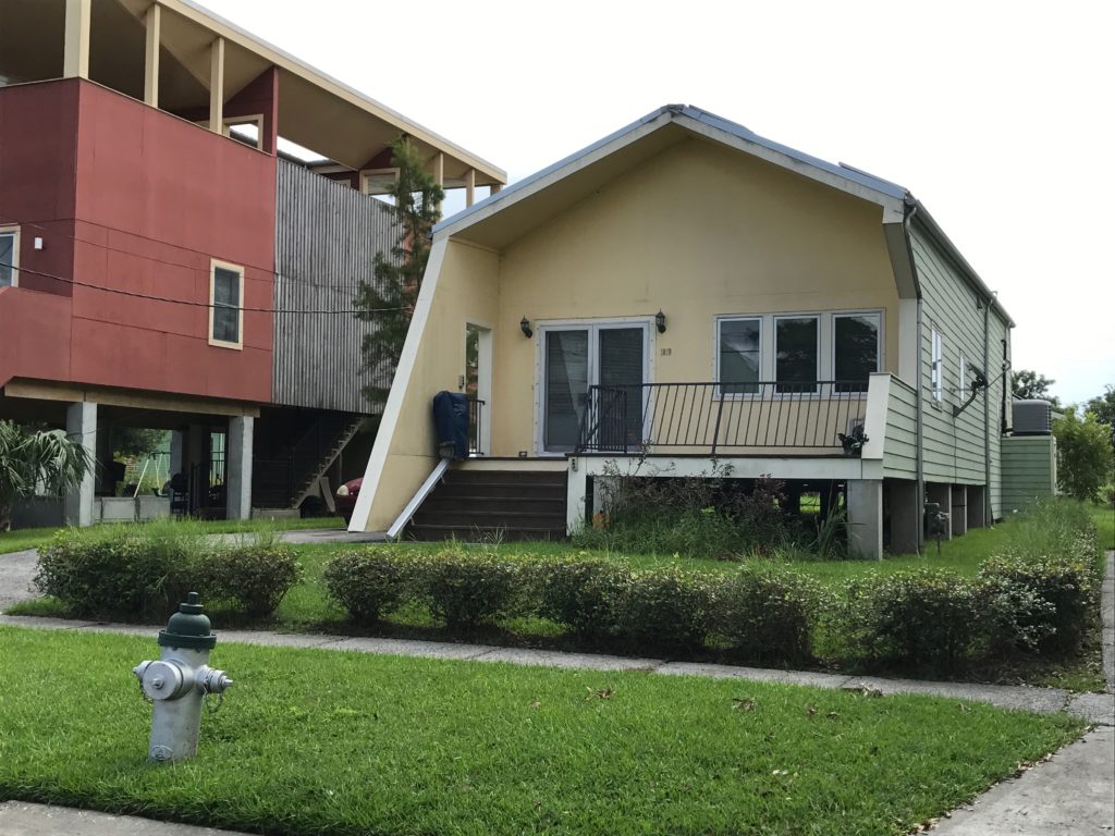
Even so, many of the roughly 140 homes stand alone: they don’t combine to create a coherent streetscape. At least most are set back the same distance from the street. And green yards, sidewalks, and trees combine to create a logical pattern. But the massing and color of the homes is all over the place. As a result, there’s very little rhythm to the block, the kind that you get in the best neighborhoods, with homes that may not be alike but at least mimic each other’s size, materials, and color scheme. (That’s something important to consider if you plan to build a home on an empty lot in an existing neighborhood. The design doesn’t need to imitate the homes around it. But it needs to pick up on their scale and massing.)
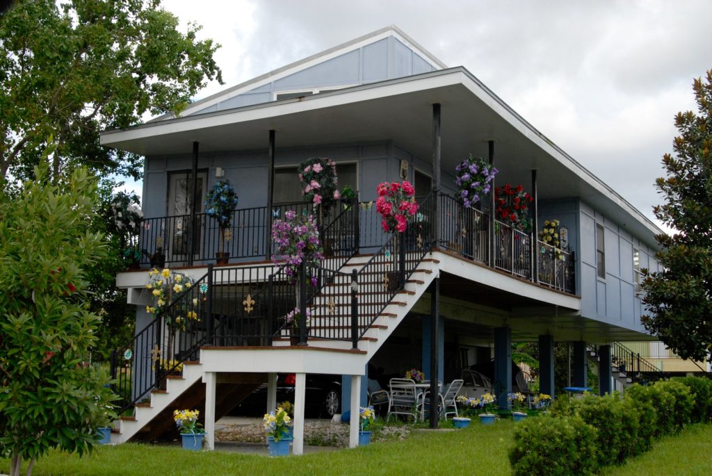
The neighborhood definitely benefited from a mid-course correction made by Pitt, who decided to reach out to local architects for homes that looks more like they belonged in New Orleans. One design by the local firm Biles Partners was built more than 17 times, partly because it could be constructed cost-efficiently but also because it included protected car parking and a usable front porch, two things locals said in focus groups that they wanted. The repetition of the design, built with different color schemes, and slightly different configurations, definitely helps ground the neighborhood. An unusual angle to the roof still gives the design a modern character.
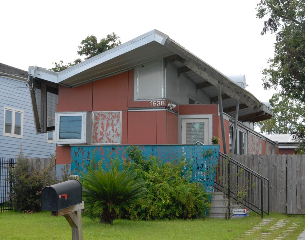
Having visited so many boring new-home subdivisions during my life, I have nothing but respect for Pitt and his foundation for trying to infuse the community with architecture. There’s a lot of creativity and whimsy in the designs. I’m particularly fond of this fanciful home by Kieran-Timberlake with its fanciful railing (like you might see on the Italianate homes downtown) that was built several times in the neighborhood. The problem, critics have pointed out, is that the front porch can only be accessed from inside, not the street. How neighborly is that?
The house by Thom Maine, known as the FLOAT house, has probably received the most attention. It was designed with guideposts allow it to rise up to 12 feet as water levels rise. It sits on a base or chassis that integrates all mechanical, electrical, plumbing, and green systems. In the event of high water, the chassis is supposed to operate like raft. The house was so expensive to build that the Foundation asked Maine’s office to design that didn’t float. The design never moved beyond the prototype stage.
Lots in the neighborhood are long and narrow, and most homes were raised 8 feet off the ground. Many look like beach houses as a result, especially when their shape is boxy. Several of them, like this one from Eskew+Dumez+Ripple look like they haven’t weathered well. The Foundation has been systematically replacing a glass-treated wood product, TimberSIL, that was used extensively for decking and exposed wood, after they noticed mildew on the material. It’s suing the manufacturer to recoup its costs.
Many of the architects say they started their designs by referencing the city’s notorious shotgun homes, long and narrow with gable roofs and pleasant front porches. But several seem to lose the shotgun DNA in pursuit of abstraction. Here’s one by the German architectural firm, Graft, which says the home grows progressively more modern as you move to the back, ending with a flat roof, rectilinear form. The flat roof serves as a “safe haven” where residents can flee in the event of another flood.


