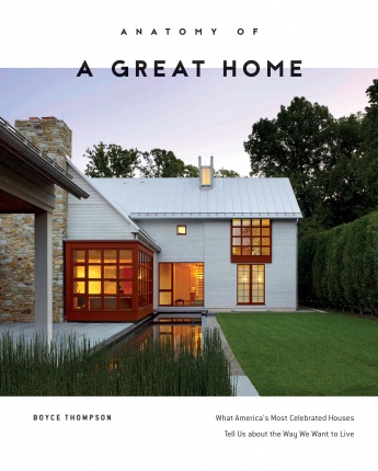
You may not notice them when first glancing at a house design, but designers often employ tricks of the trade to make their homes look larger, live better, and go together more economically. The touches could be as subtle as a raised vanity that allows you to run tile to the wall in case you want to change it later or as obvious as a big porch overhang that blocks summer sun. Here are 10 less-than-obvious design techniques to look for as you consider buying or building a home, tactics covered in detail in my book, Anatomy of a Great Home.

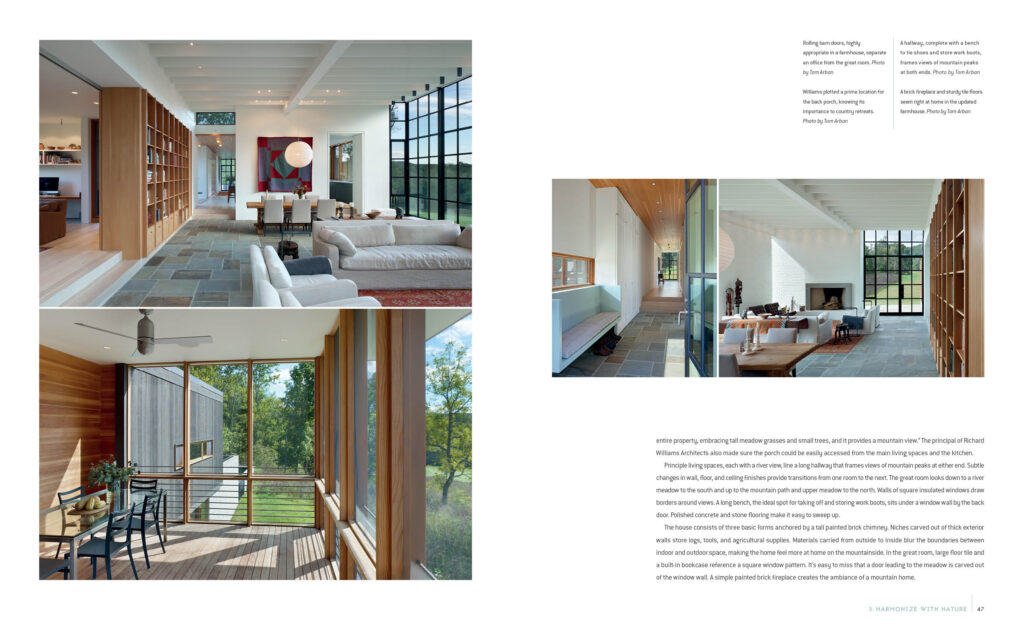
1. Rooms that borrow space from each other. The classic example, which you find repeatedly in new-home design, is a great room plan with a kitchen and family room that occupy one big space. But even if the great room adjoins a closed room, like a home office, it could be separated by a sliding door – barn doors are all the rage — that could be left open when no one’s home. You close it when the family comes home if you still need to work. Another common technique to create separation but allow light to pass is to leave a half wall between, say, a dining area and a great room. You often see parlors or music rooms separate from the rest of the house by French doors. That way practicing musicians aren’t completely isolated.
2. Blurred boundaries between indoor and outdoor space. These days, many new homes employ sliding glass doors to blur the boundary between a great room and a patio or outdoor room. Some doors fold back accordion style or pocket into the wall, which makes the back porch read like an indoor space. It’s a great look in a luxury home, especially when floor and ceiling treatments extend indoors to outdoors to cement the impression of one living area. A less expensive approach, though, may be to use a 16-foot sliding unit, with two inside doors that slide over two outer doors, providing an 8-foot opening in 16 feet of glass. “It’s considerably less expensive than a multi-slide or multi-fold door unit,” says architect Janet Hobbs.
3. Inexpensive drywall details. Wood beams certainly draw attention to the ceiling of a great room or living room. But you can often create equally interesting and less expensive ceiling motifs with drywall, especially when they are highlighted by lighting. Another money-saving technique is to create a simple, enclosed pantry with drywall instead of cabinetry behind a conventional interior door. Inexpensive sheetrock details can be used throughout the house – on the staircase, in the kitchen – to create a design motif for your home.
4. A lack of dedicated hallway space. The best designs anticipate how people move from one room to another. They minimize square footage dedicated to pure circulation in favor of connected living space. The result: homes that feel more luxurious. When hall space can’t be avoided, a good approach is to use it for multiple purposes; maybe there’s room for a homework den. Widening the upstairs hallway by only one foot may provide enough depth for built-in bookshelves.

5. Windows that frame outdoor views. When strategically located, windows draw the eye to exterior views, making homes appear larger and more inviting. The optimal situation is when windows frame landscaping views, especially if that’s the view upon entering a house or key public room. Light enters a room from two directions and cuts down on glare. A reflective surface near a window – something as simple as a sill or a table — will bounce natural light into a room, reducing the need for electric lighting. Windows on two sides of a room allow the house to “breathe” by creating natural airflow.
6. A potential first-floor master suite. You may be fine climbing stairs to a second-floor master bedroom today, but what about 15 years from now? When your hips or knees go, you may appreciate having the potential to create a first-floor master bedroom. If you have a room — maybe it’s an office now but could be a bedroom later — close to a powder, sometimes the hallway can be reconfigured to create an en-suite situation. Some designers anticipate this contingency by placing a closet or utility space next to the powder so that it could one day be expanded to include a shower.
7. Space for a pocket office. Many homeowners these days find that creating an alcove for a pocket office is a more effective use of space than having a dedicated home office. Maybe all you need is a small recess with a desk to pay the bills and take notes while making an occasional phone call. The beauty of today’s strong wireless systems is that you can work anywhere you want in the home, maybe even outdoors. You may still want a dedicated home office if you are on the phone all day, attend teleconferences, or see clients. A dedicated office space became useful during the pandemic, especially when children were home.
8. Bathtubs instead of stall showers in some secondary baths. The beauty of old-fashioned bathtubs is that they take up less space. Most are 30 inches wide instead of the minimum 42 inches needed for a decent stall shower. They also cost less since a shower requires a pan, extra tile work, shower glass, and extra labor to assemble. You may still want to have at least one other stall shower — besides the one in the master — for the person who doesn’t want to or can’t step into a tub. New production homes now commonly feature pedestal bathtubs that occupy even less space and provide a focal point for a bathroom.
9. Floating cabinets in the bath. You may want these just because they look cool. They provide the added benefit of creating a longer uninterrupted view of the floor, making a compact bathroom feel larger. They also make it easier to replace flooring material if you want to update the room. You may even save a little money on smaller cabinets that don’t run all the way to the floor. Maybe the savings could go into dramatic under-cabinet lighting.
10. A second-floor laundry. Back in the day, stay-at-home parents appreciated having the laundry near the kitchen; they could cook dinner and check on the wash. But dual-income families on the go may prefer the laundry on the second floor, close to the master bath, where dirty clothes are discarded and clean ones put away. “This saves steps when you realize that shirt you meant to wear is still in the dryer,” says Hobbs. Stacking washers and dryers means you could put the laundry in a hall closet, though that arrangement may not leave much space for folding clothes.